Now booking for November & December
All work
Brand identity + packaging

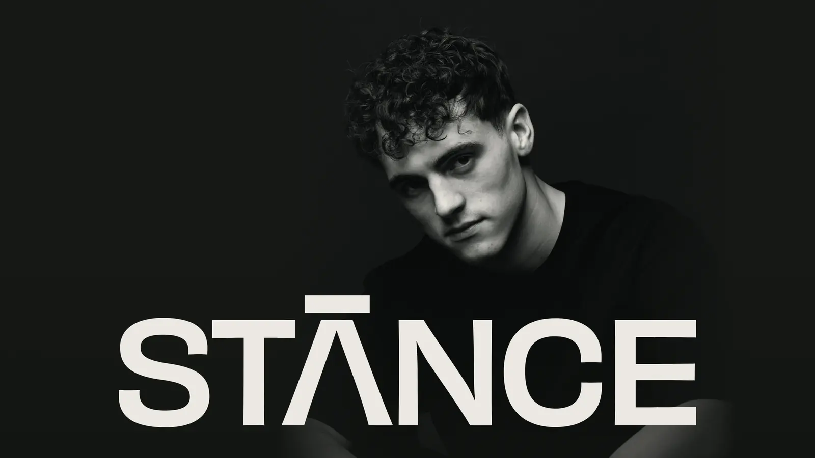
STANCE

Hold your ground.

PackagingMenswearLogo system

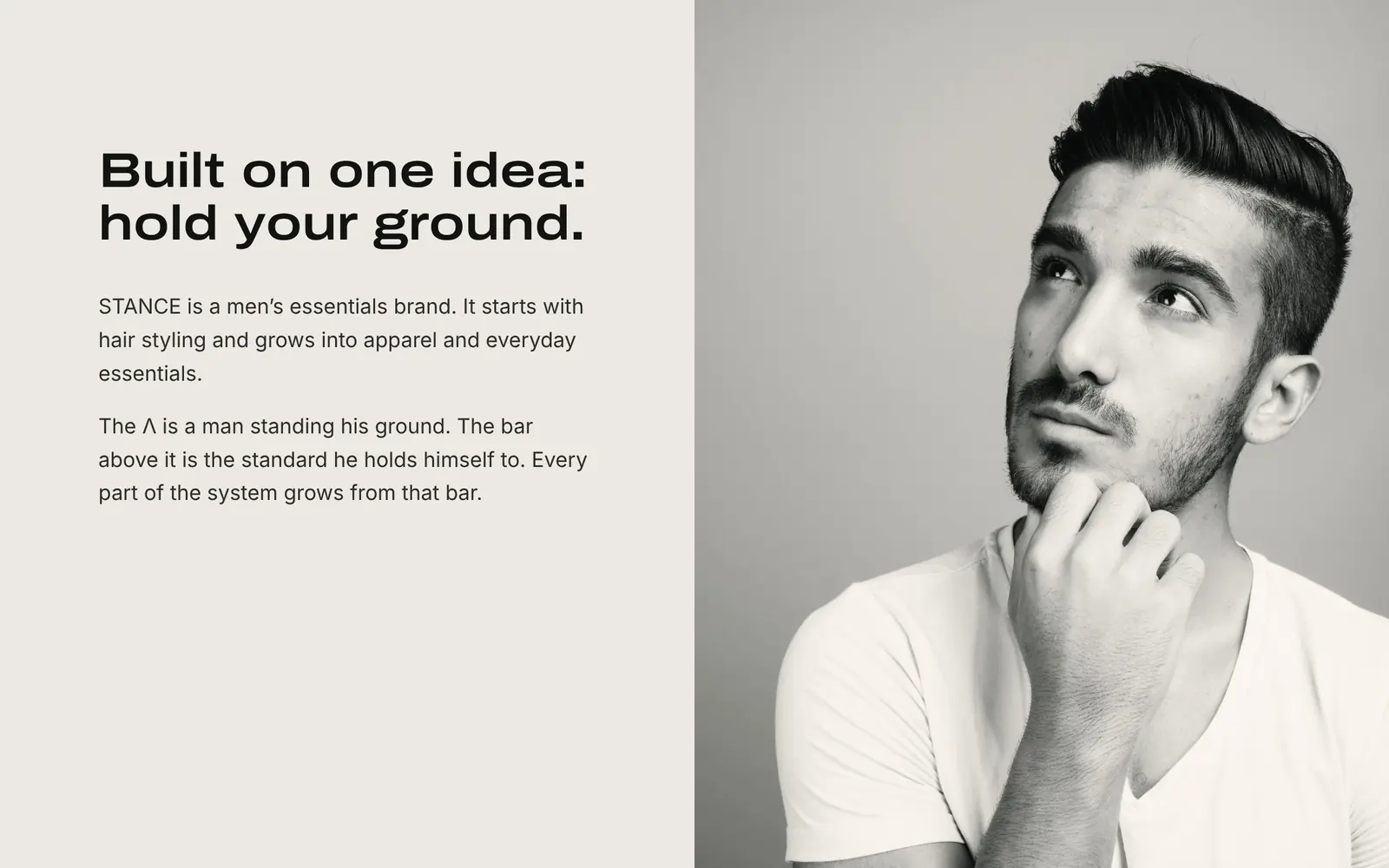
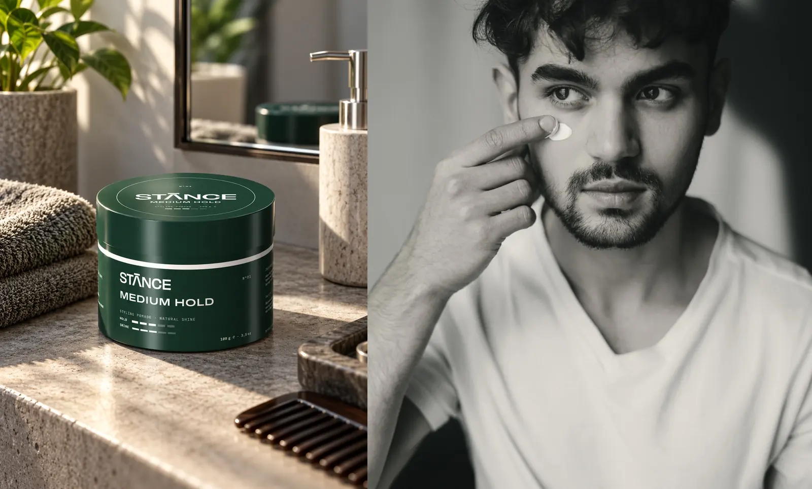
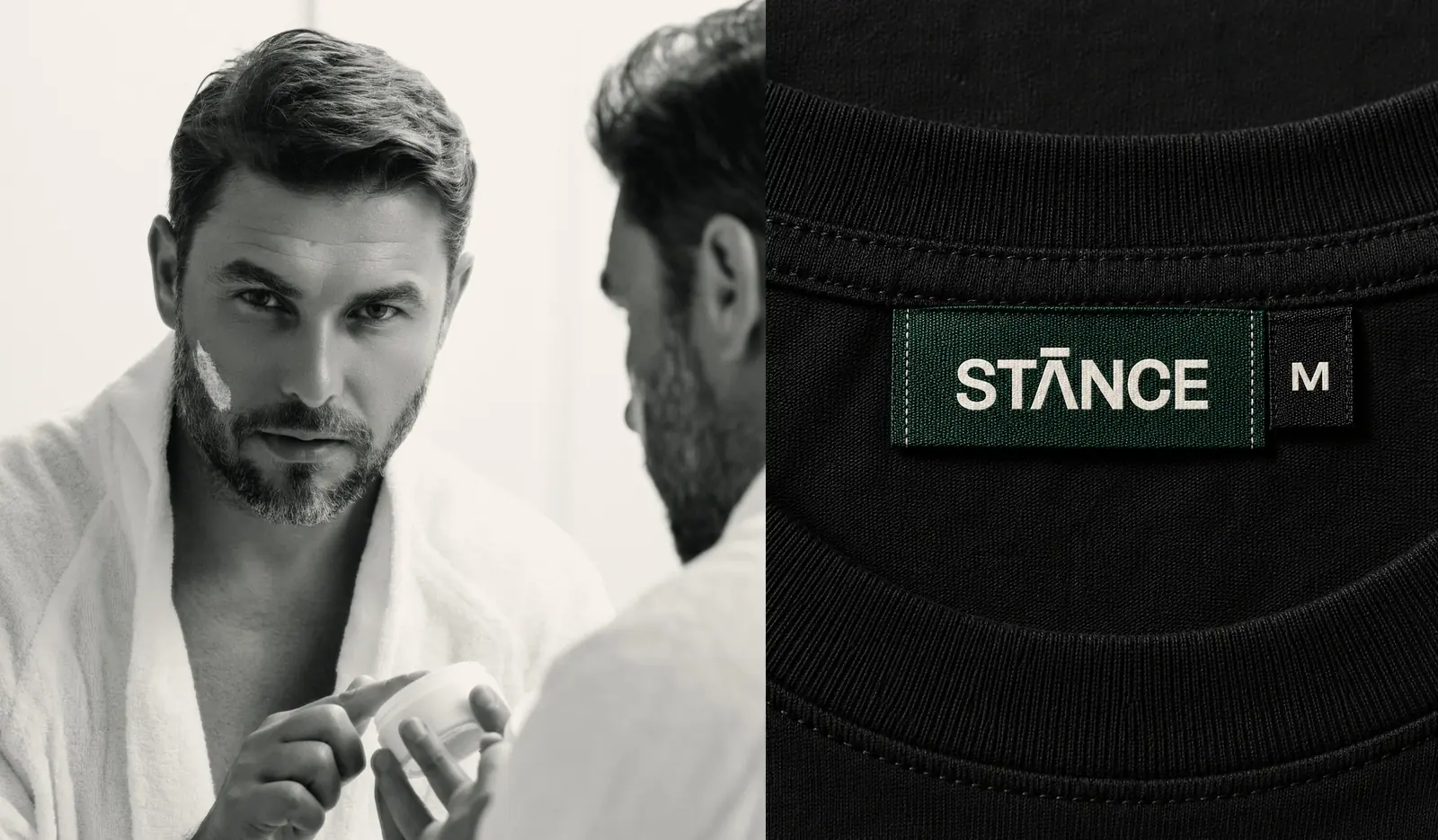
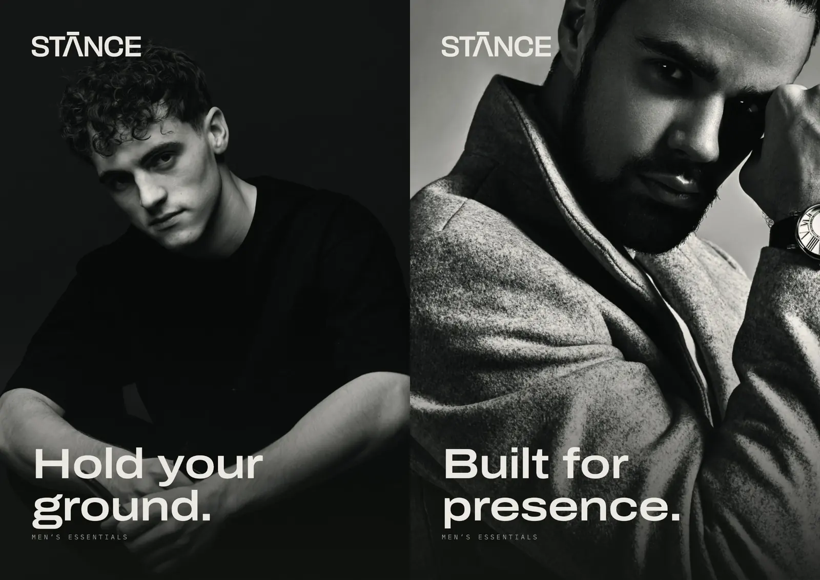
STANCE is a men’s essentials brand. It starts with hair styling and grows into apparel and everyday essentials.

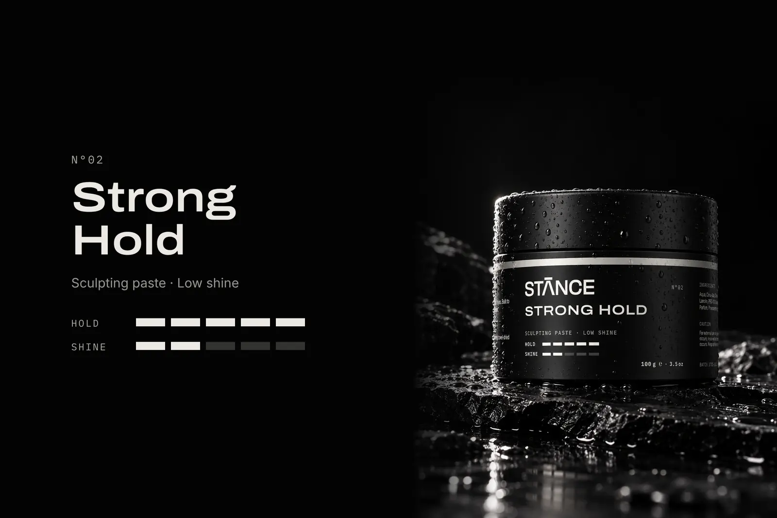
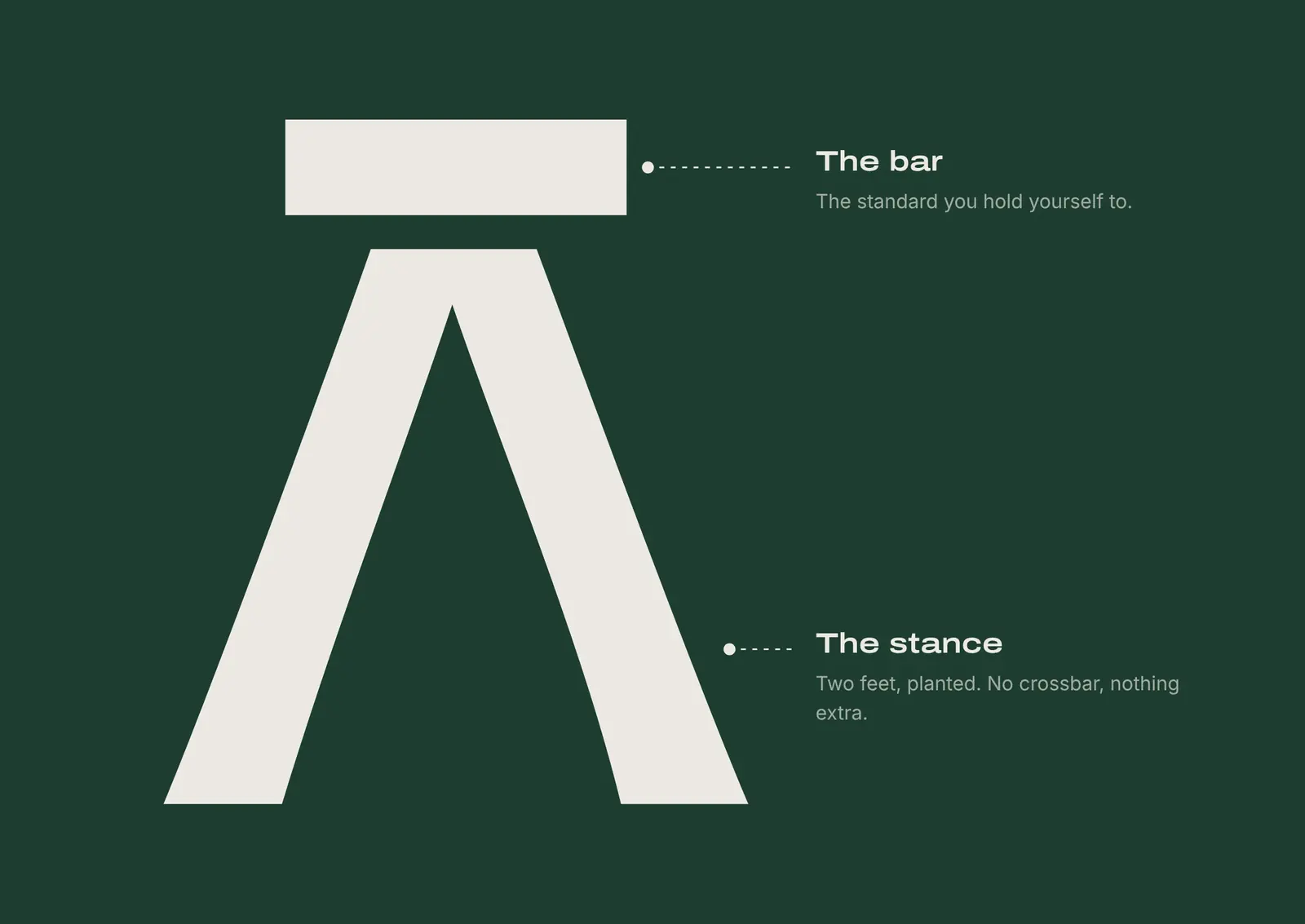
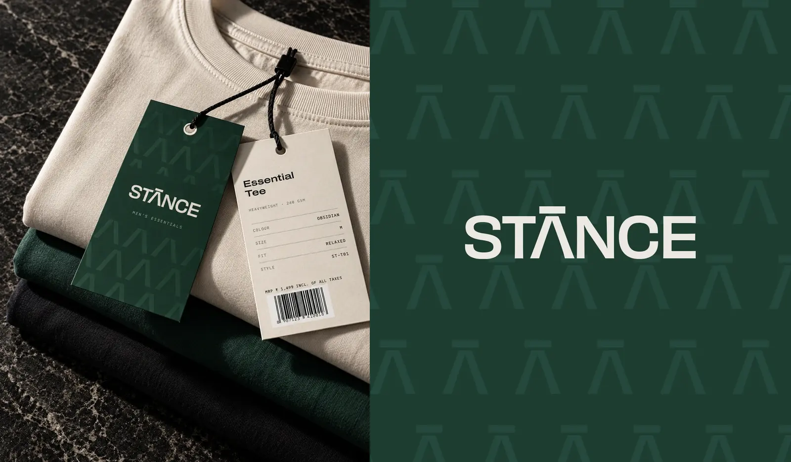
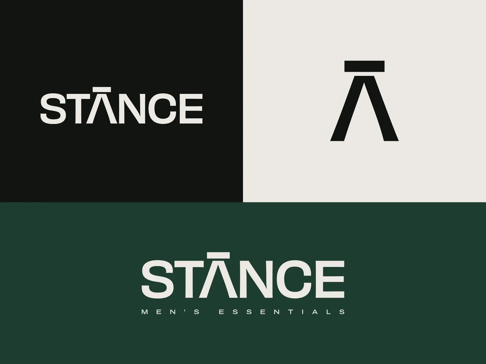
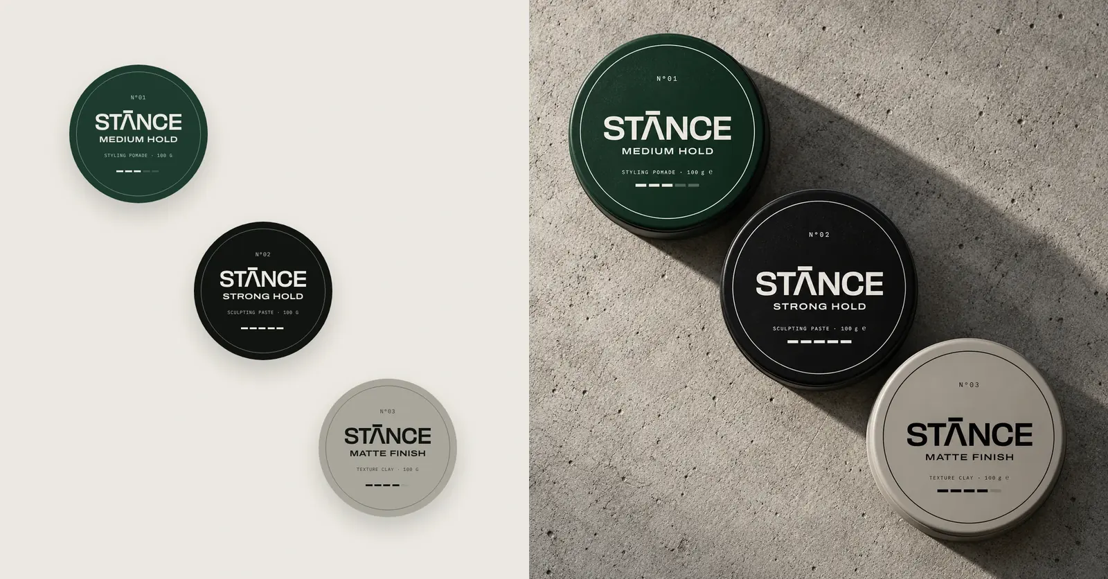
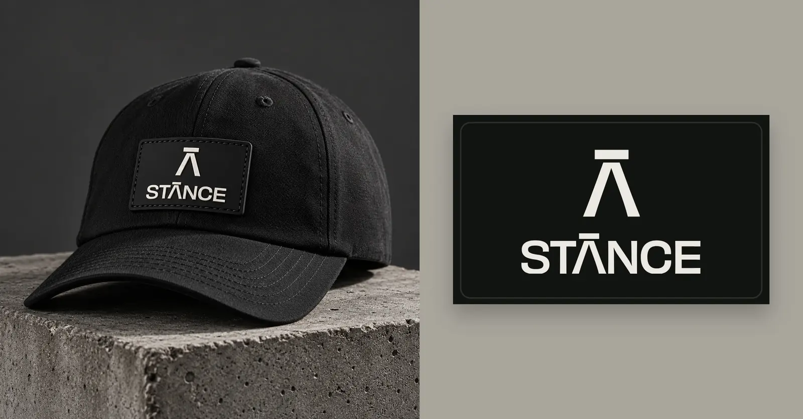
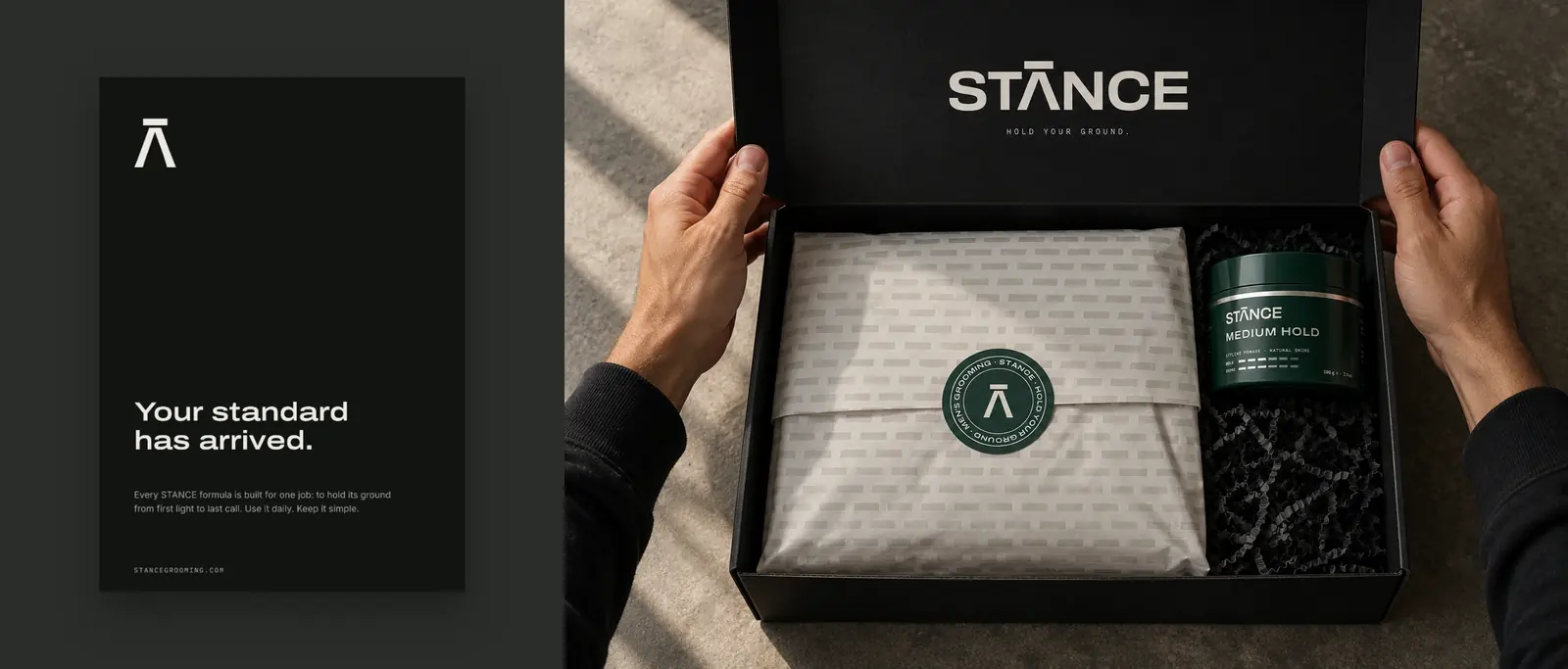
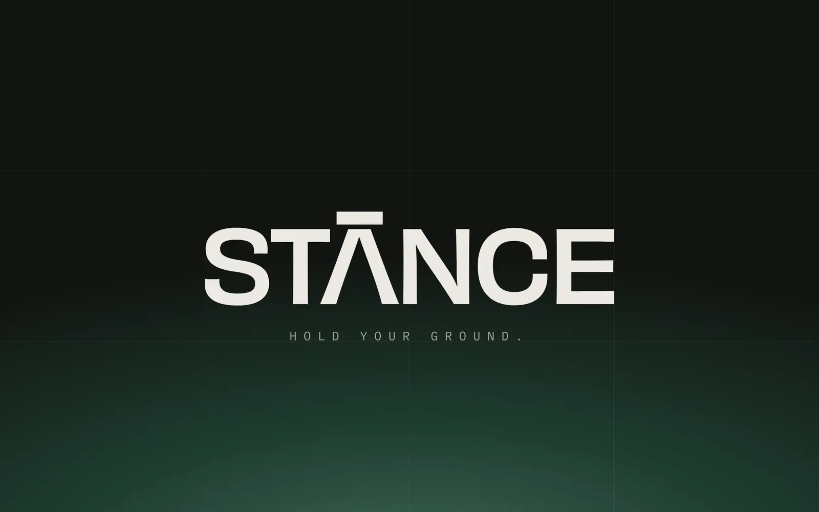
The identity is built from the logo itself. The Λ, an A with no crossbar, is a man standing his ground. The bar floating above it is the standard he holds himself to. That bar drives the whole system: the hold and shine scales on every jar, the band on the cartons, the pattern on tags and tissue, and the patch on the cap.

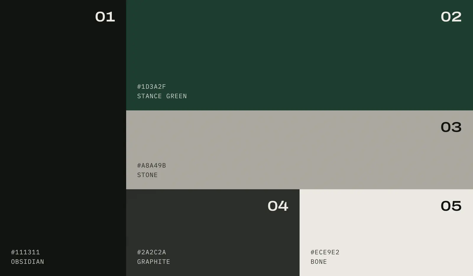
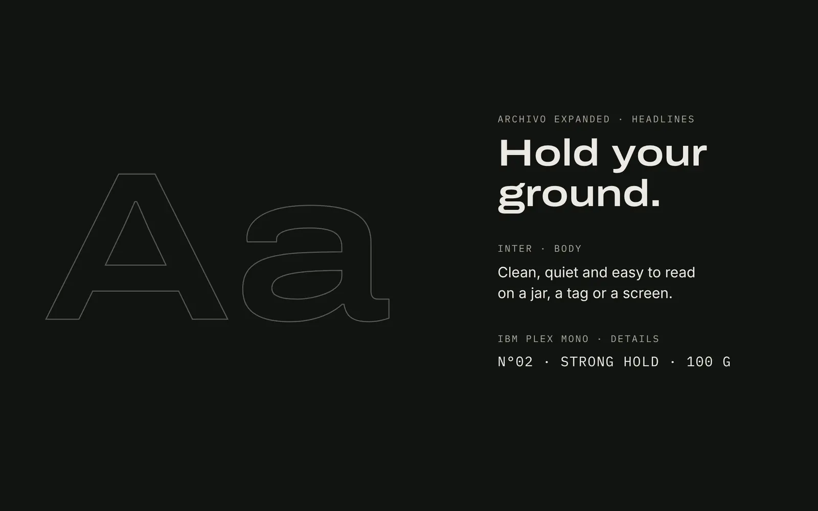
The palette stays quiet: Obsidian, Stance Green, Stone, Graphite and Bone. Archivo Expanded carries the headlines, Inter the body copy and IBM Plex Mono the product details. The result is confident without being loud.

Client
STANCE Men’s Essentials
Services
Brand strategy, logo system, colour & typography, packaging, apparel labels, campaign, retail
Industry
Men’s grooming & apparel
Location
New York, USA
Year
2026
STANCE brand identity – image 1
STANCE brand identity – image 2
STANCE brand identity – image 3
STANCE brand identity – image 4
STANCE brand identity – image 5
STANCE brand identity – image 6
STANCE brand identity – image 7
STANCE brand identity – image 8
STANCE brand identity – image 9
STANCE brand identity – image 10
STANCE brand identity – image 11
STANCE brand identity – image 12
STANCE brand identity – image 13
STANCE brand identity – image 14
STANCE brand identity – image 15
STANCE brand identity – image 16

Good things begin with a Hello 👋

Tell me about your brand, your idea or your next launch, and let’s give it an identity people remember.