RODA
Gather. Share. Stay a While.
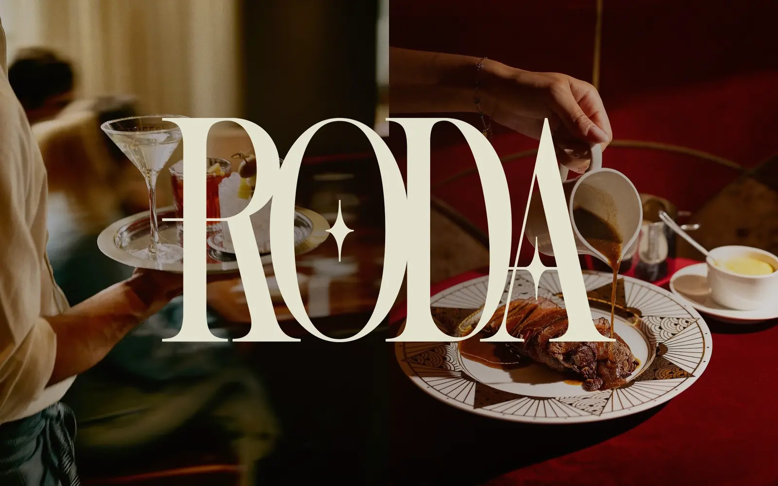
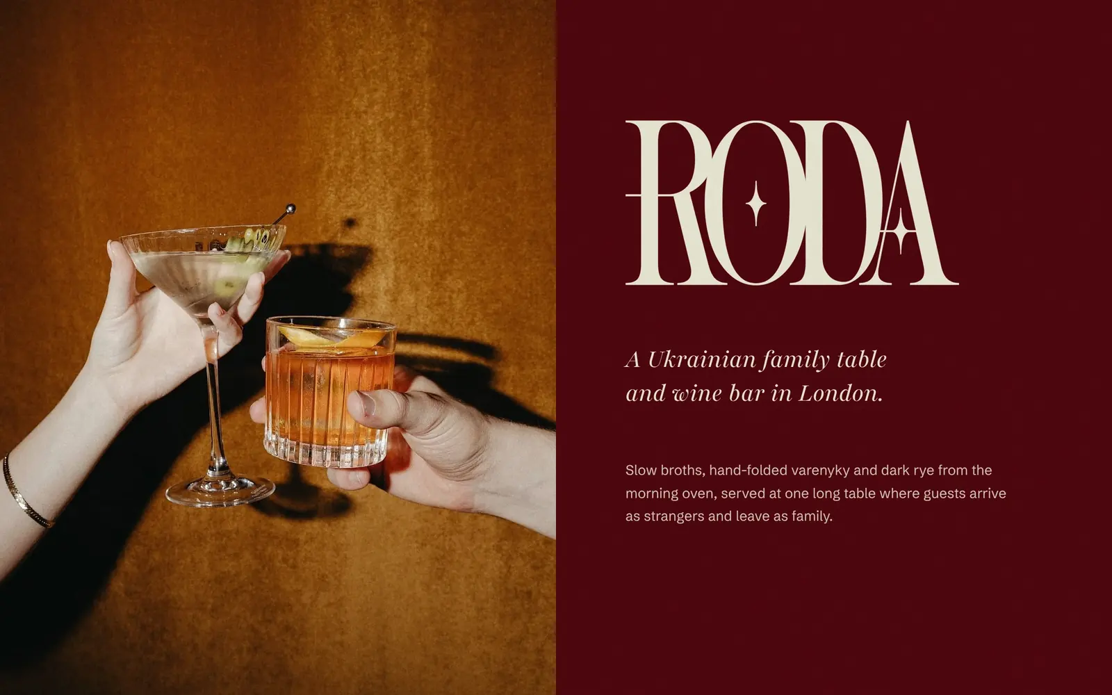
RODA comes from the Slavic word for kin and family. It is a restaurant built around one long table, where slow broths, hand-folded varenyky and dark rye from the morning oven are shared by guests who arrive as strangers and leave as family.
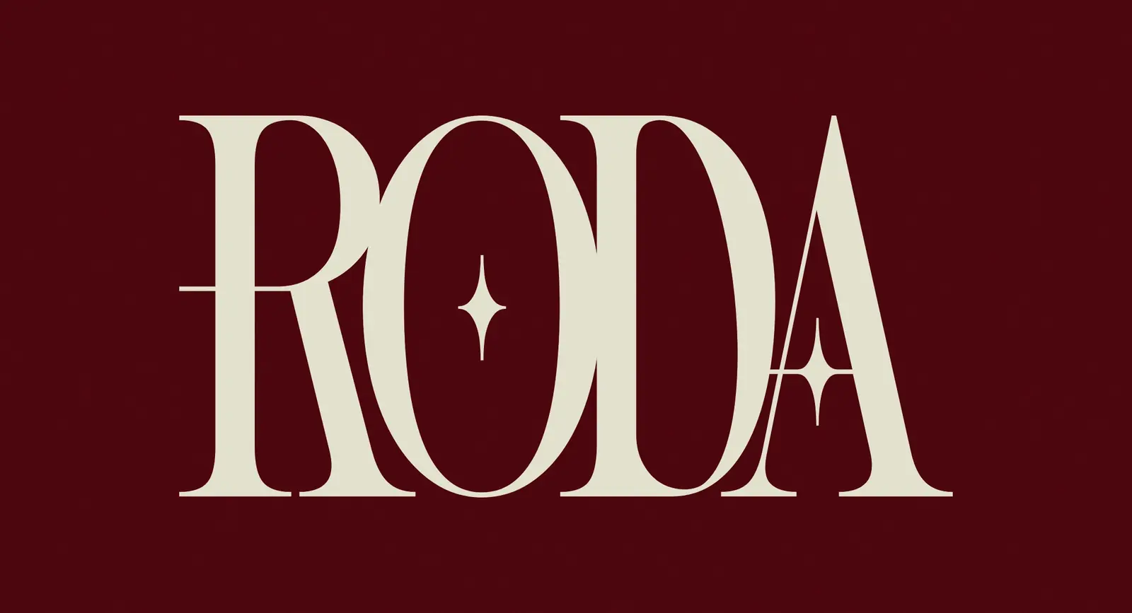
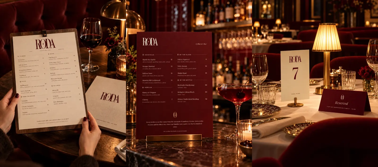
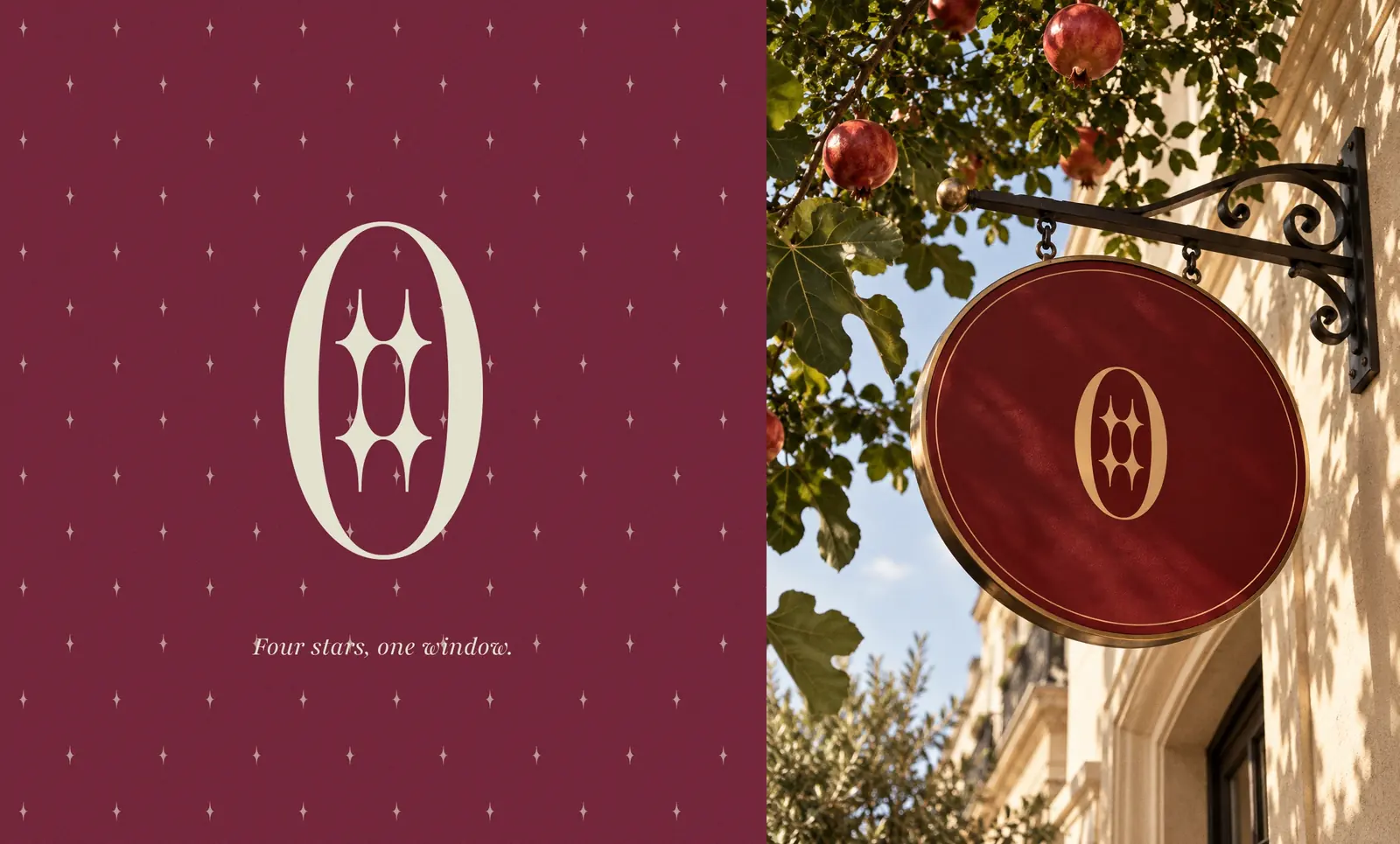
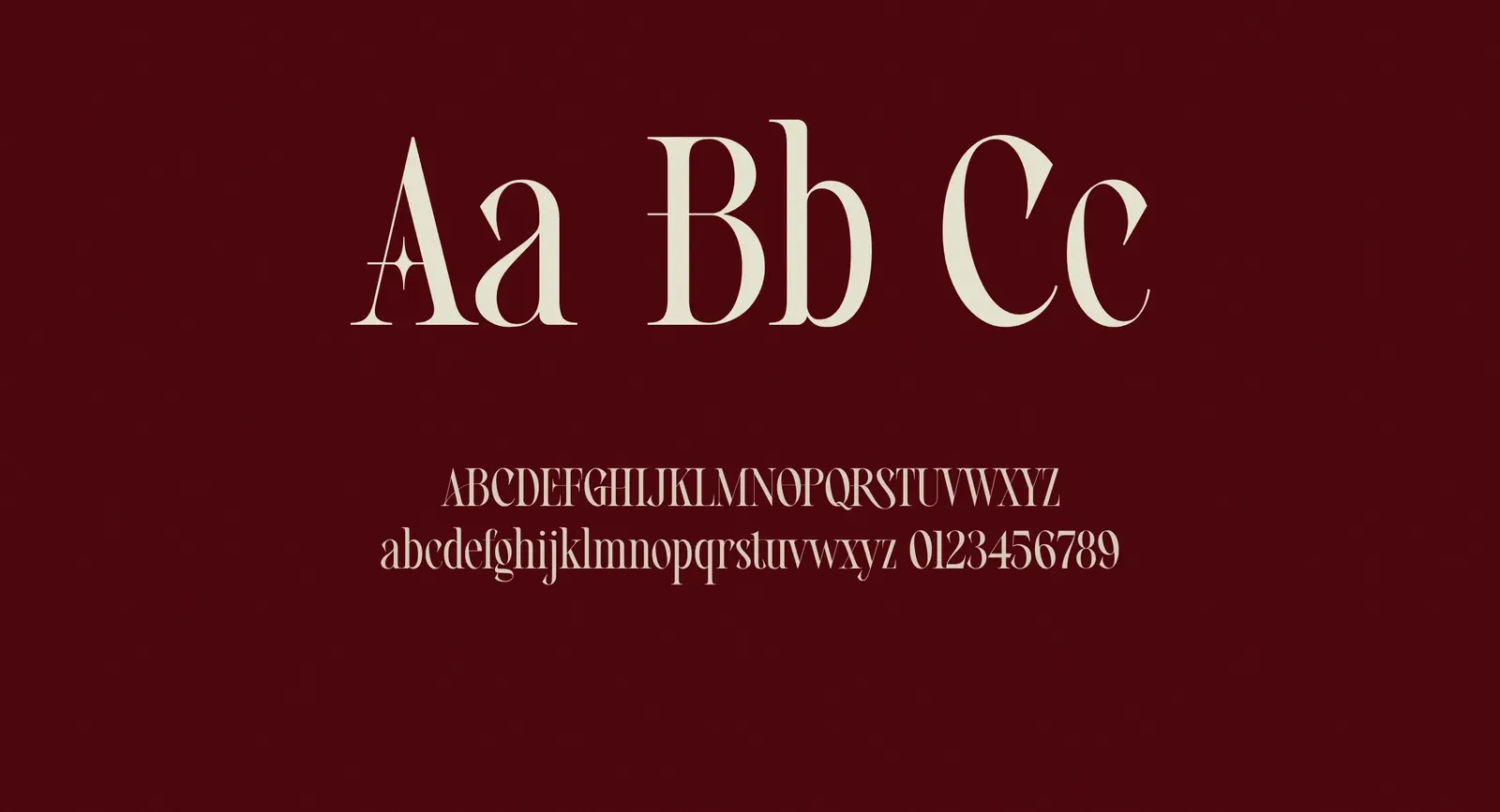
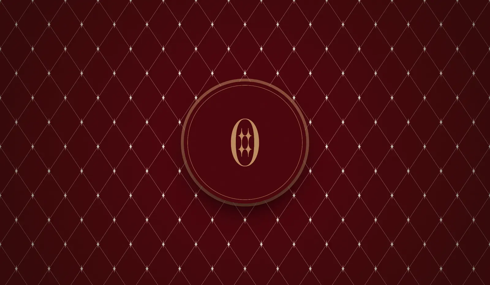
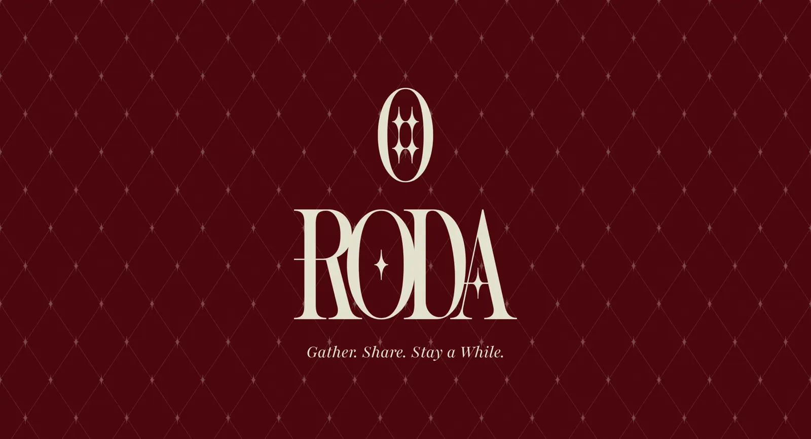
The identity is built to feel like that room at night: warm, calm and quietly luxurious. A bold, high-contrast Didone wordmark carries a small four-point star inside the O and on the A. The logomark is a tall O holding four stars, like windows lit after dark.
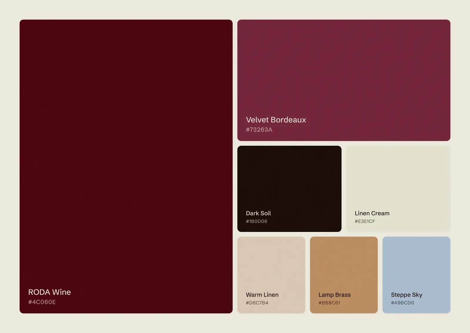
Aged wine and velvet bordeaux lead the palette, grounded by dark soil and softened with linen, with lamp brass and steppe sky as small accents. Vamour gives the brand its dramatic display voice, supported by a classic serif with a soft italic.
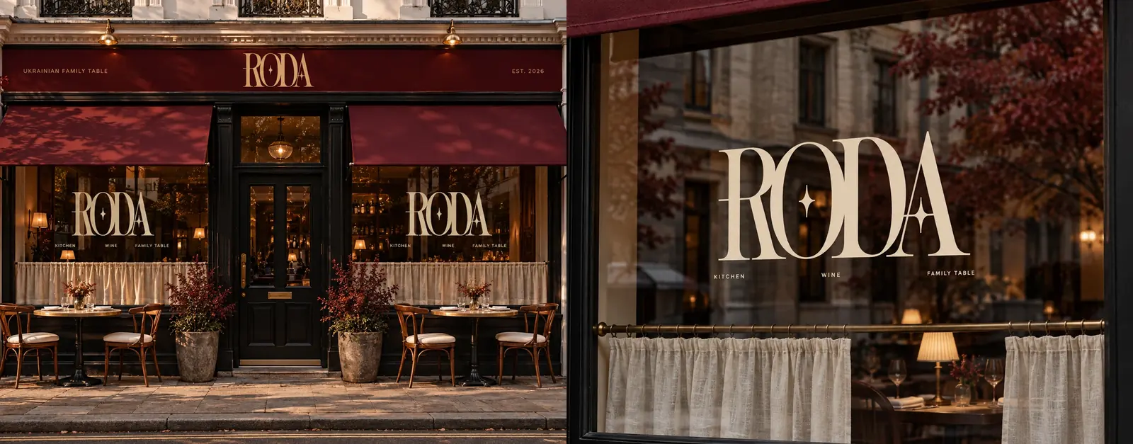
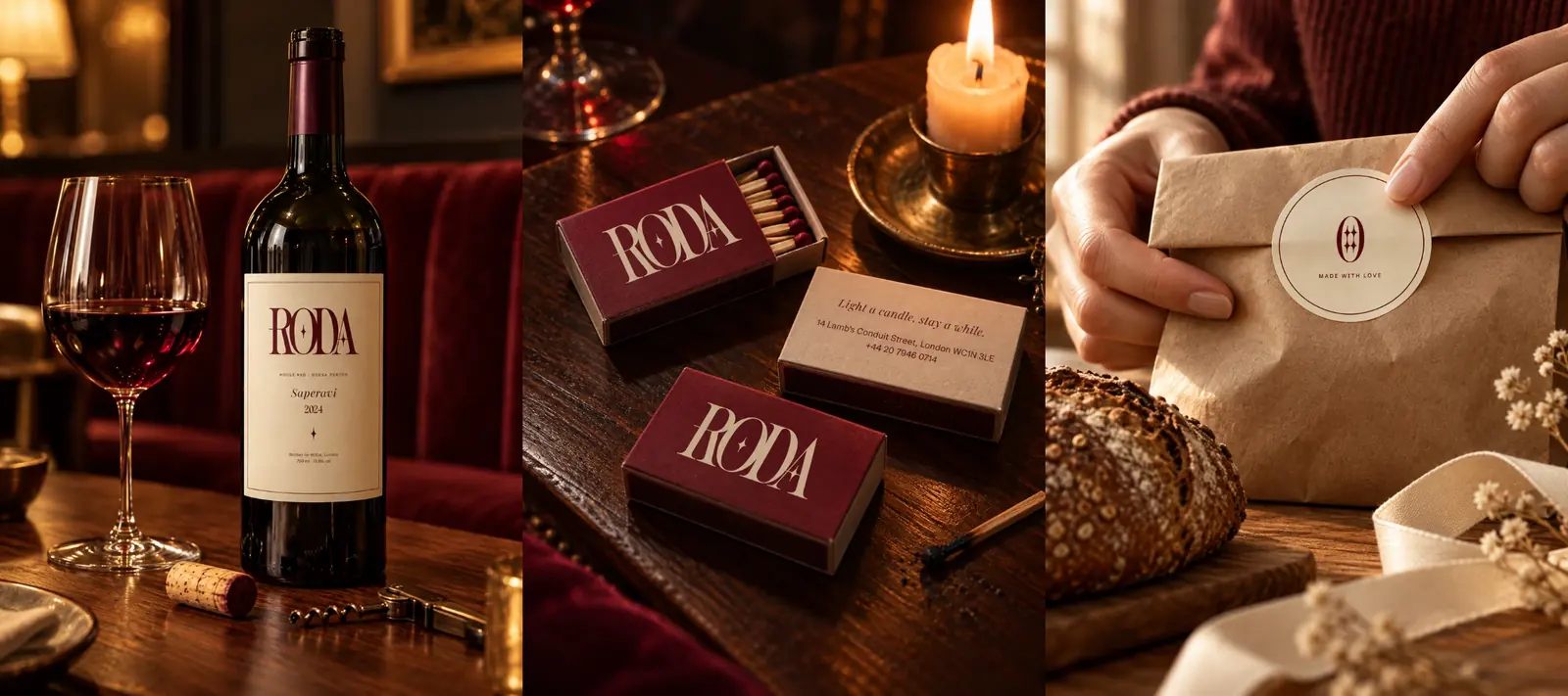
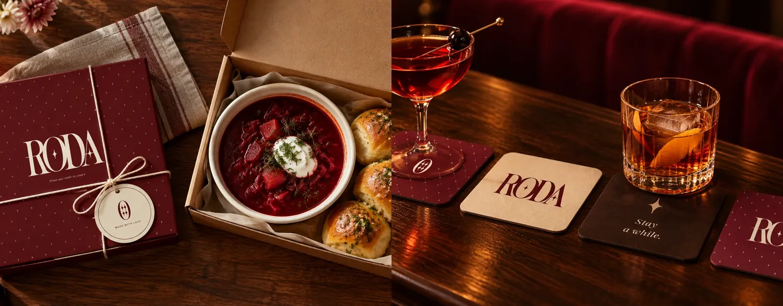
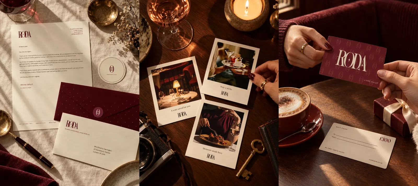
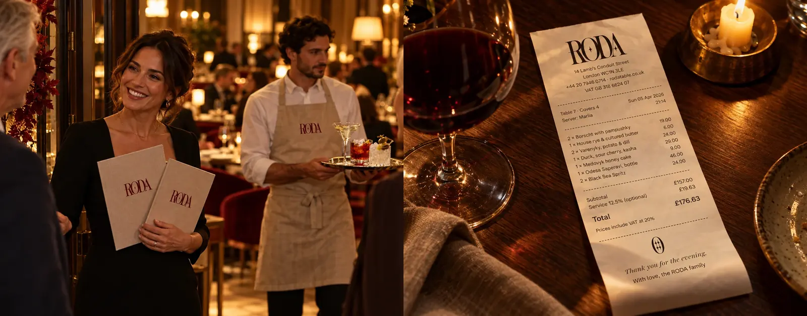
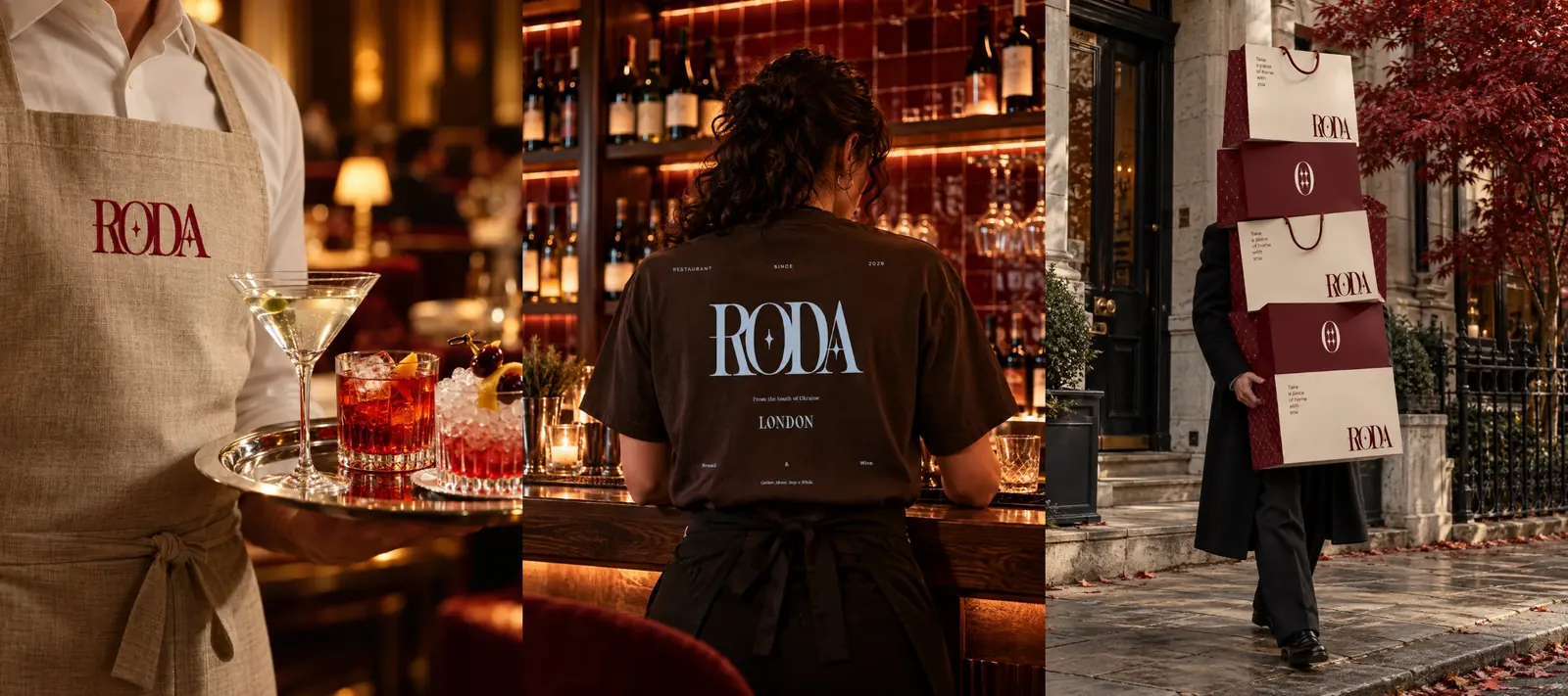
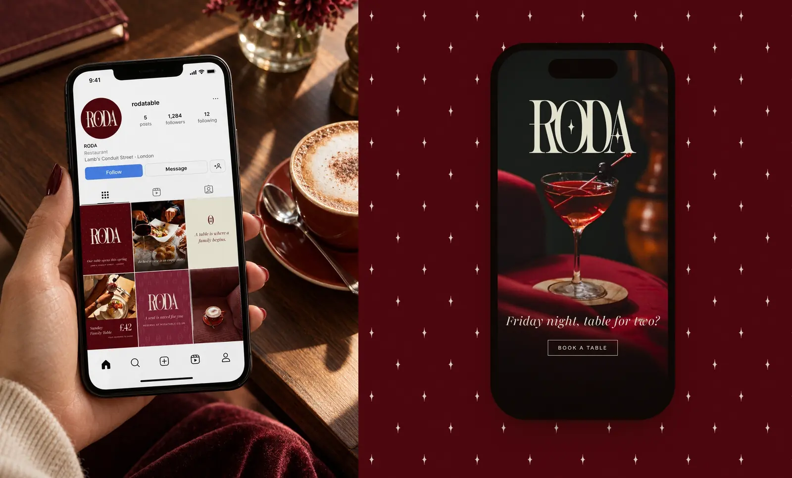
From menus and stationery to the storefront, uniforms and social media, every touchpoint carries the same feeling as the table itself.
- Client
- RODA, Ukrainian family table
- Services
- Brand identity, logo design, menus, packaging, signage
- Industry
- Restaurant & hospitality
- Location
- London, United Kingdom
- Year
- 2026