The right colour combination can make or break a design. Here are five creative colour palettes, with Pantone codes and hex values, that we use to give posters, packaging and brand identities instant personality.
A well-planned colour palette communicates a brand's personality, builds an emotional connection and makes even a simple visual stand out. But a great combination is not about colours that look beautiful on their own. It is about how shades interact, balance each other and what they say together.
From bold and energetic to earthy and sophisticated, these five palettes can completely change the direction of a brand identity, packaging design, social media post or advertising campaign.
1. Orange Tiger, Coconut Milk & Riverside: bold and energetic
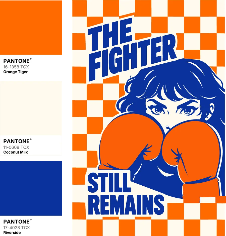
Some palettes stand out because of pure contrast, and this is one of them. Orange Tiger brings heat and energy, Riverside adds a deep, confident blue, and Coconut Milk softens everything with a warm off-white that gives the layout room to breathe.
Why this colour combination works
Orange and blue sit opposite each other on the colour wheel, so they create natural, high-impact contrast. The creamy neutral keeps that contrast from feeling loud, which makes the palette feel both contemporary and timeless.
Where to use it
- Editorial and poster design
- Sports, fitness and youth brands
- Creative advertising campaigns
- Typography-led social media posts
Design tip: use Coconut Milk as the background, Riverside for headlines and illustration, and keep Orange Tiger for patterns or one key element so it pops.
2. Burgundy, Avocado Oil & Pesto: earthy and sophisticated
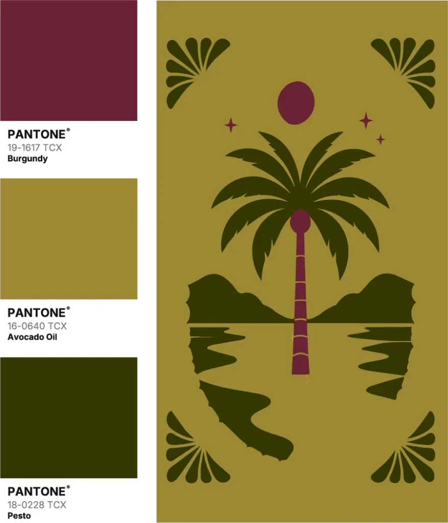
If you want a palette that feels rich, distinctive and a little vintage, try this one. Avocado Oil brings a warm golden olive, Pesto adds a deep earthy green, and Burgundy gives depth and quiet sophistication.
Why this colour combination works
All three shades are muted and grounded. They have enough difference to create variety, yet they never look over-coordinated, so the result feels natural and premium.
Where to use it
- Artisan and lifestyle branding
- Restaurant and café identities
- Packaging design
- Vintage-inspired posters and illustration
Design tip: do not use all three in equal amounts. Let Avocado Oil lead, use Pesto for the main artwork, and save Burgundy for small accents.
3. Sun-Dried Tomato, Powder Pink & Cherry Tomato: warm and playful
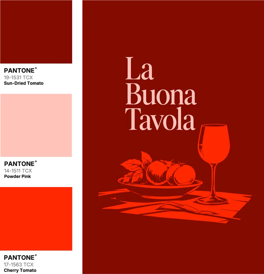
Warm palettes bring instant energy. Sun-Dried Tomato sets a deep, intense red base, Powder Pink adds softness, and Cherry Tomato delivers a bright burst of excitement.
Why this colour combination works
The three colours belong to the same warm family, so they feel harmonious. Their differences in brightness and saturation create depth, while the vivid red-orange gives you a ready-made highlight colour.
Where to use it
- Food and beverage branding
- Restaurant menus and posters
- Promotional graphics
- Bold, typography-led designs
Design tip: let Sun-Dried Tomato be the foundation, use Powder Pink for type and balance, and bring in Cherry Tomato only for the details you want noticed first.
4. Potting Soil, Olive Oil & Fuchsia Pink: earthy with a playful twist
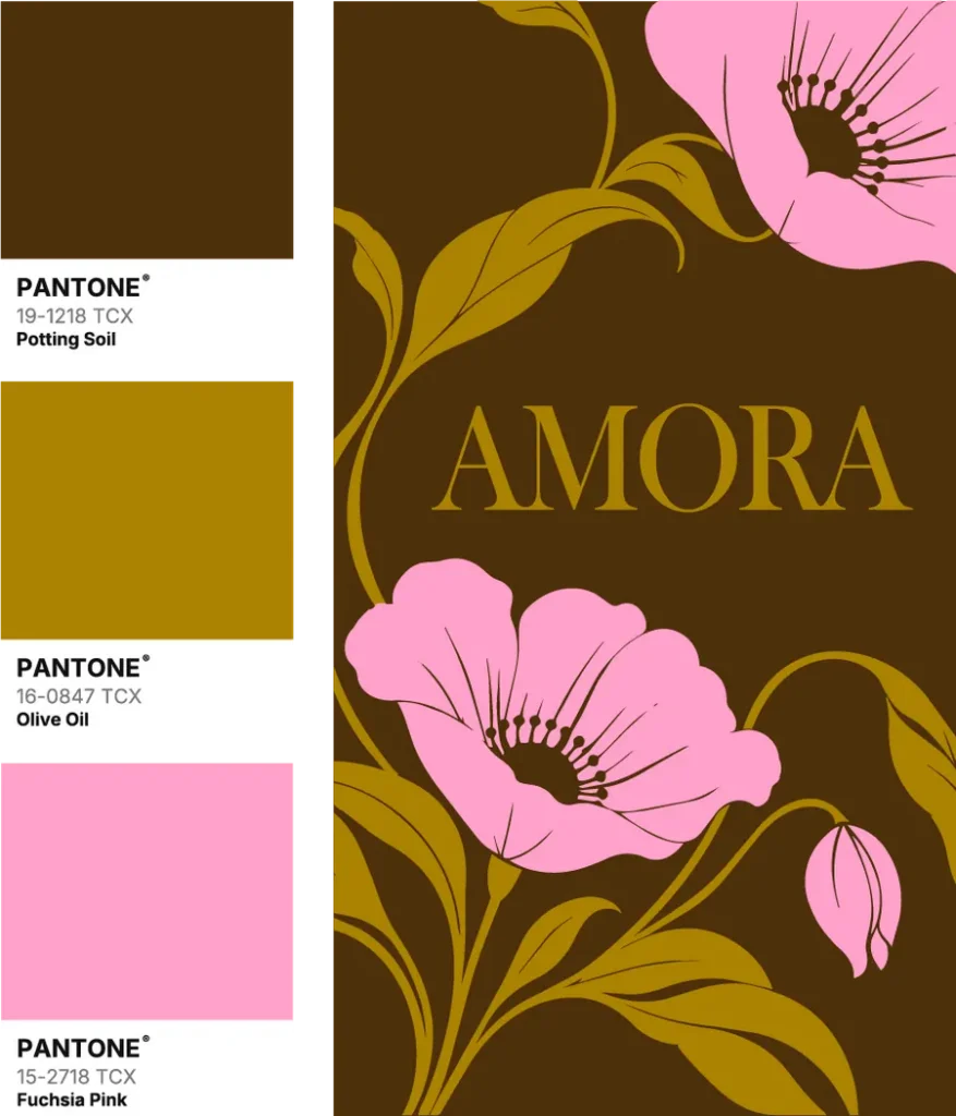
This palette proves earthy colours do not have to be serious. Potting Soil is a rich, chocolate brown, Olive Oil adds a golden warmth, and Fuchsia Pink brings an unexpected, feminine pop.
Why this colour combination works
The dark brown creates a strong foundation that makes both the golden olive and the bright pink glow. The surprise of pink against natural tones gives the design a distinctive, boutique character.
Where to use it
- Beauty, fashion and jewellery brands
- Boutique and lifestyle identities
- Premium packaging
- Floral and botanical illustration
Design tip: keep Potting Soil as the dominant colour, use Olive Oil for typography and linework, and let Fuchsia Pink appear in one or two large shapes.
5. Fired Brick, Popcorn & Avocado: rich and contemporary
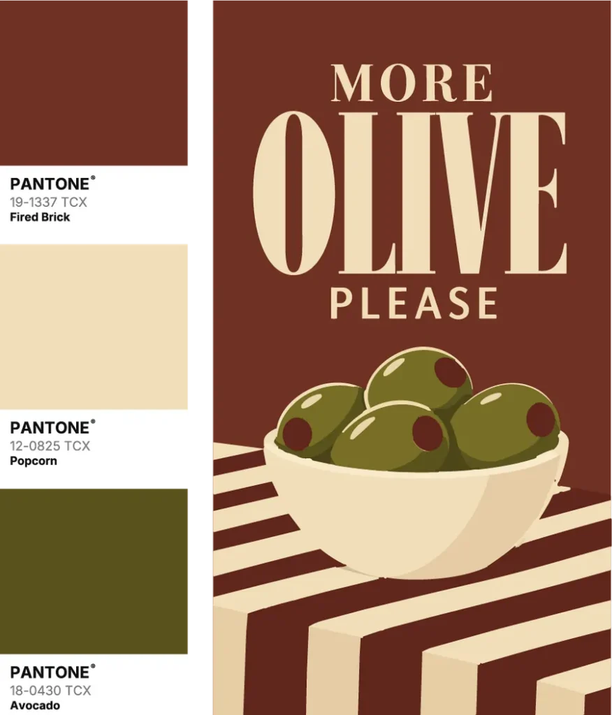
Not every strong design needs bright or highly saturated colours. Fired Brick brings a warm, earthy red-brown, Popcorn adds a soft creamy neutral, and Avocado introduces an organic, grounded green.
Why this colour combination works
All three have muted undertones, so they pair naturally. The light Popcorn against the darker brick and green creates clear contrast while keeping the overall look calm and refined.
Where to use it
- Gourmet food and deli brands
- Organic and sustainable packaging
- Wellness and lifestyle brands
- Minimal editorial design
Design tip: use Fired Brick as the background, Popcorn for type and stripes, and Avocado for the hero illustration.
How to choose the right colour palette for your design
Knowing beautiful combinations is only the beginning. The real skill is choosing a palette that supports the purpose of your design.
1. Start with the mood
Every palette creates a different impression. Before picking colours, define your brand's personality and the feeling you want people to have.
2. Use colour harmony
Explore complementary, analogous and triadic schemes. A little colour theory helps you build palettes that feel intentional.
3. Check contrast and readability
Your palette needs enough contrast for text to be readable and for important elements to stand out. Consider brightness and saturation, not just hue.
4. Balance your colours
Too many dominant colours feel overwhelming. Pick one primary colour, one or two supporting colours and one accent, roughly in a 60/30/10 split.
5. Test in the real design
A palette can look perfect as swatches and feel different on type, backgrounds and photos. Always test it inside the actual layout.
Final thoughts
Colour is more than decoration. It is one of the most powerful communication tools in graphic design, shaping how people feel about a brand before they read a single word.
Not sure which palette fits your brand? Let's find it together.