An image can capture attention, but a well-crafted design gives it a purpose.
We often come across visually appealing photographs, product shots and illustrations. While these images can communicate something on their own, they don't necessarily function as effective designs. The real transformation happens when creative elements come together to tell a story, convey a message or encourage action.
So, what exactly separates an image from a design? And how can graphic designers turn ordinary visuals into impactful communication?
Let's understand the difference.
1. An Image Captures Attention, A Design Communicates a Message
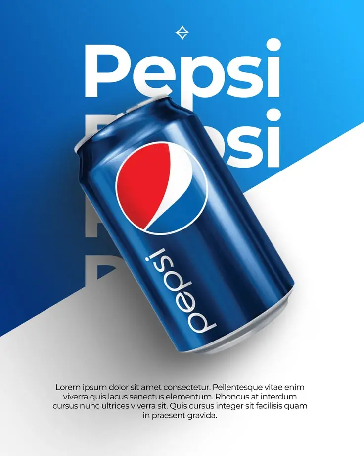
An image is primarily a visual representation of something. It could be a photograph, product shot, illustration or digital artwork.
A design, however, goes beyond the visual itself. It combines different elements to communicate a specific idea or message.
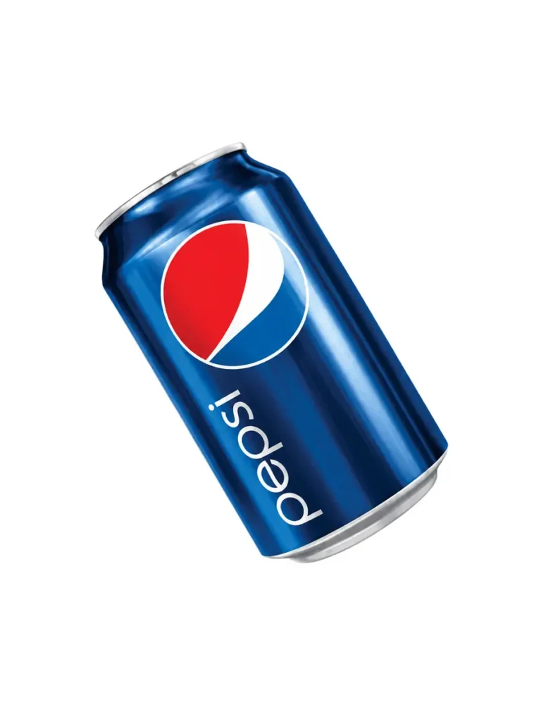
For example, a photograph of a Pepsi can is simply an image. But when that same photograph is placed within a thoughtfully designed advertisement, supported by typography, colours, brand elements and a clear visual direction, it becomes a marketing creative.
The key difference? An image shows something, while a design communicates something through it.
2. Composition and Layout Give Visuals a Direction

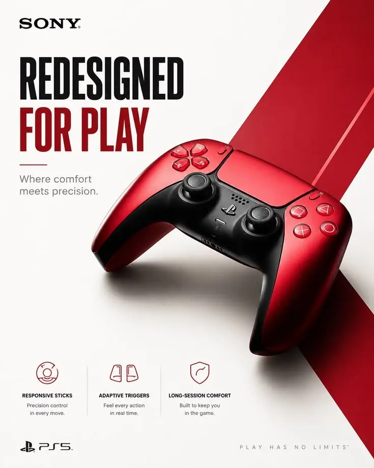
A good design is never just about placing elements together. Every element needs a reason to be where it is.
Composition and layout determine how different visual elements interact with each other. They help establish balance, alignment, spacing and visual flow.
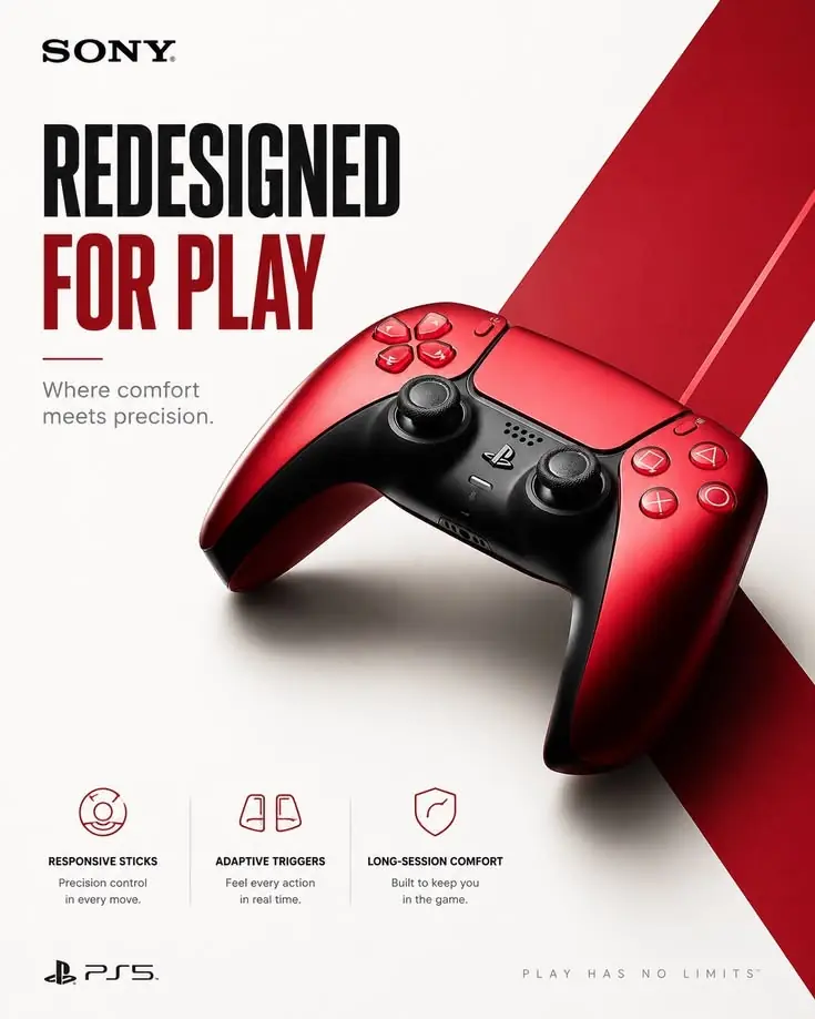
Consider a product photograph of a gaming controller. On its own, it showcases the product. But when incorporated into a promotional poster with a structured layout, bold typography, contrasting colours and supporting information, it immediately communicates a stronger message.
A well-planned layout guides the viewer's eyes and makes the overall design easier to understand.
Design tip: Always establish a visual hierarchy before arranging elements. Decide what viewers should notice first, second and third.
3. Typography Turns Visuals into Communication


Typography is one of the most powerful tools in graphic design. The right font, size, weight and placement can completely change how a visual is perceived.
Imagine a photograph of a delicious meal. While the image may attract attention, adding a compelling headline, supporting text and relevant information can turn it into an effective restaurant advertisement.
Typography doesn't simply fill empty spaces. It adds context, creates personality and makes the intended message easier to understand.
Whether you're designing a social media post, promotional poster, brand advertisement or website banner, thoughtful typography can make a significant difference.
Design tip: Choose fonts that complement the visual's personality and maintain a clear distinction between headlines and supporting text.
4. Colour, Contrast and Visual Hierarchy Create Impact
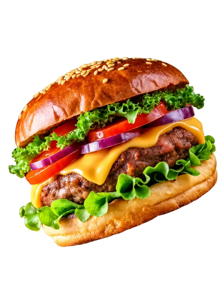
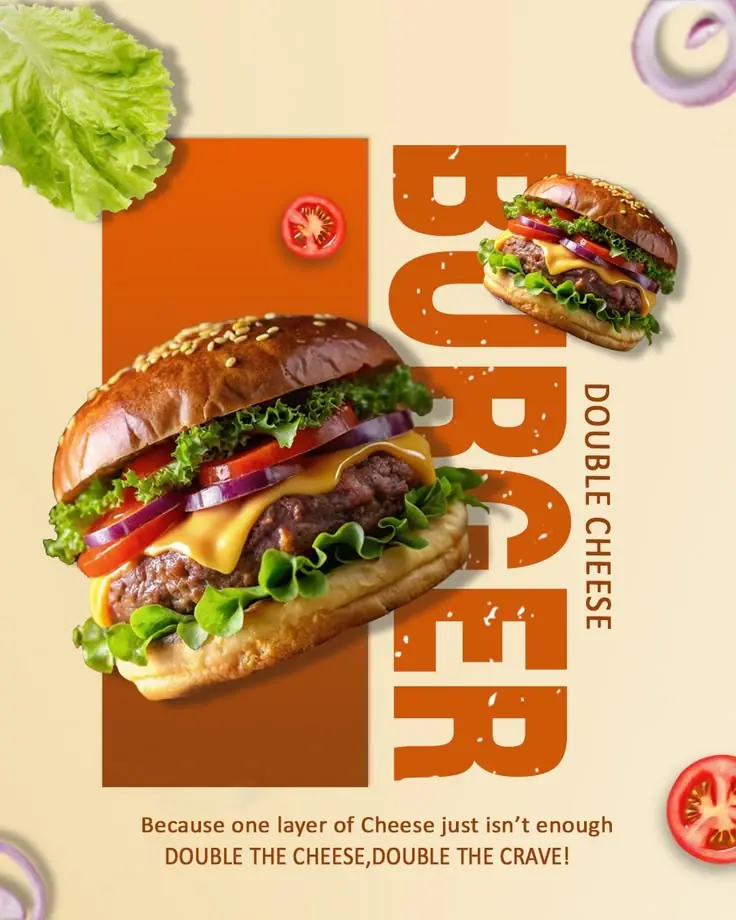
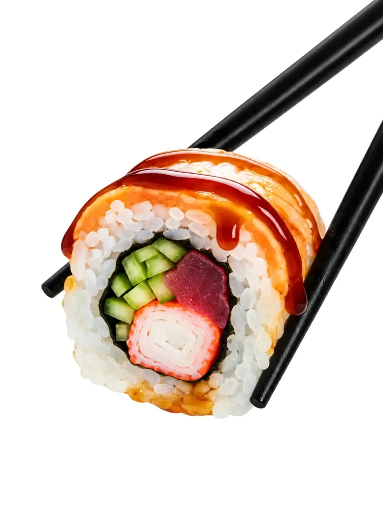
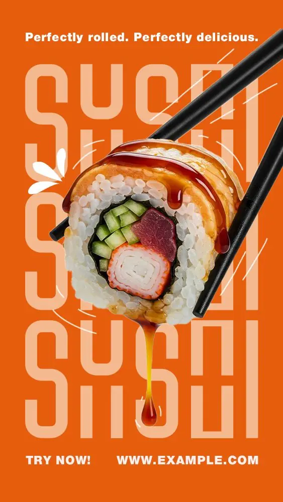
A visually appealing image doesn't automatically make an effective advertisement. Sometimes, the missing element is contrast and a clear focal point.
Colour and contrast help separate important elements, create visual interest and establish a clear direction for the viewer.
Take a sushi photograph, for instance. Placing it against a vibrant background, introducing contrasting typography and using a structured composition can transform a simple food image into an attention-grabbing promotional creative.
The same principle applies to product advertisements, social media graphics, event posters and brand campaigns.
Design tip: Use contrast strategically to highlight important information, establish a focal point and make your design more visually engaging.
Final Thoughts: Great Design Goes Beyond Aesthetics
The difference between an image and a design lies in intention.
An image can be beautiful, but a design needs to communicate. It requires thoughtful decisions about composition, typography, colour, hierarchy and the message being delivered.
As graphic designers, the goal isn't just to make visuals look attractive. It's to transform ideas into meaningful visual communication that captures attention and leaves an impression.
Remember: Don't just use an image. Give it a purpose, a story and a direction.