Creative graphic design is the art of taking an ordinary idea and making people stop, look and remember it. In this guide we share four techniques we use every day at Newlydesign, with real before and after examples: composition, typography, detail and contrast.
Have you ever looked at a plain poster and wondered how a few changes in typography, colour or layout could make it feel completely different? That is the interesting part of graphic design.
Design is not just arranging text and images on a canvas. It is experimenting with visual elements, exploring different directions and finding the clearest, most memorable way to communicate an idea. The same content can create a completely different experience depending on how it is presented.
A headline can become the centrepiece of a layout. An ordinary product photo can turn into a striking visual. One colour change can shift the whole personality of a brand. Here is how that transformation happens.
1. Composition: the power of visual arrangement
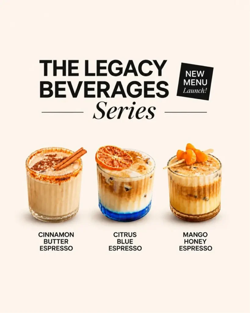
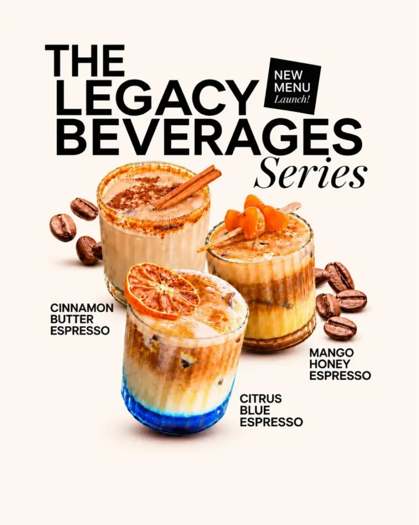
One of the fastest ways to transform a design is to change its composition. Most layouts follow a familiar structure: headline at the top, image in the centre, details at the bottom. It works, but it is predictable.
Try arranging elements at different scales, letting objects overlap, or moving the main visual away from the centre. In the example above, stacking the drinks at different sizes creates depth and movement that the flat row of glasses could not.
What makes a strong composition?
- Visual hierarchy: decide which element deserves attention first.
- Scale and proportion: mix large and small elements to create contrast.
- Negative space: give every element room to breathe.
- Balance: spread visual weight without making the layout feel static.
- Overlapping: layer elements to add depth and interaction.
A better composition rarely needs more elements. Often, removing what is unnecessary and rearranging what remains gives a much stronger result.
2. Typography as a visual element, not just text
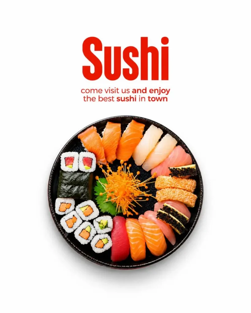
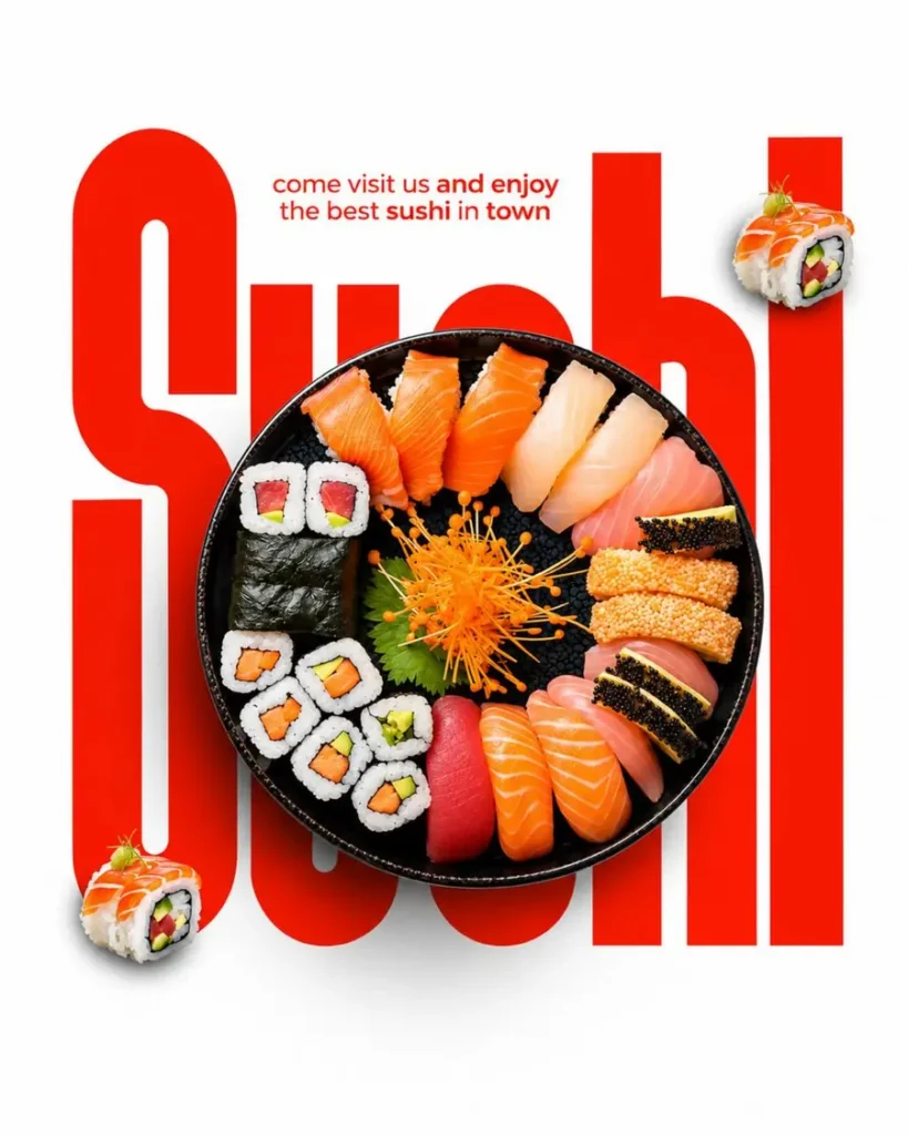
Typography is one of the most powerful tools in graphic design. Usually text is there to inform, but in expressive layouts the type itself can become the main visual. In the sushi poster, the oversized word sits behind the platter and turns a simple product shot into a bold, editorial design.
Typography techniques worth trying
- Oversized typography: large lettering creates an instant focal point.
- Type as image: treat words as graphic shapes within the composition.
- Font pairing: combine contrasting typefaces to build personality.
- Scale variation: create hierarchy with clearly different text sizes.
- Creative alignment: experiment with unexpected positioning and spacing.
The right typography can make a design feel luxurious, playful, modern or editorial. It is not a finishing touch. It is part of the concept from the start.
3. Adding details that make simple designs engaging
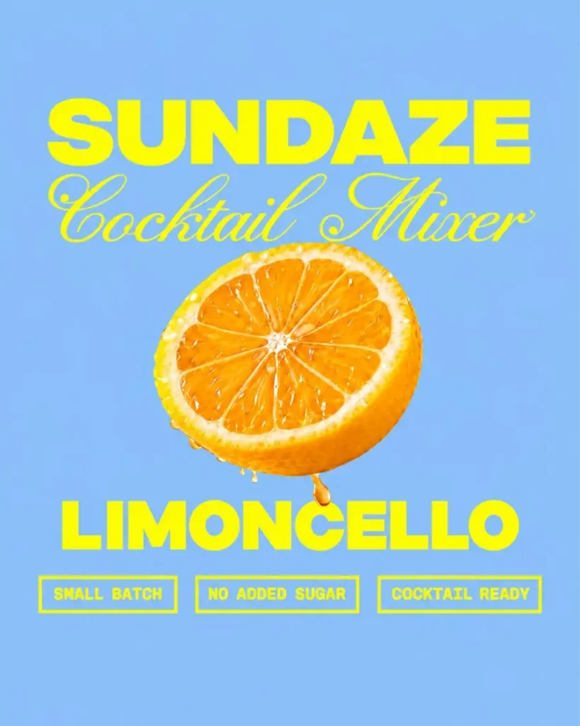
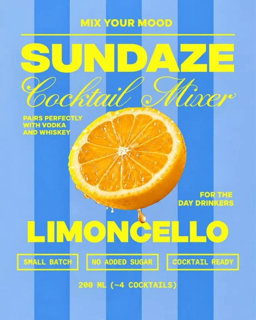
Sometimes a design looks clean but feels unfinished. The type, colours and image are right, yet something is missing. Thoughtful details can bring depth, character and personality to a simple layout, like the bold stripes and small info badges on the cocktail poster above.
Adding details does not mean filling every empty space. It means finding a few places where the design can become more interesting without losing clarity.
Ways to elevate a simple layout
- Supporting graphics: illustrations, shapes or icons that support the main idea.
- Textures and patterns: subtle grain, gradients or stripes for depth.
- Small accents: lines, labels, badges and symbols that reward a closer look.
- Layering: combine elements to create dimension.
- Visual storytelling: choose details that reinforce the concept, not just decorate it.
4. Contrast: giving your design a clear direction
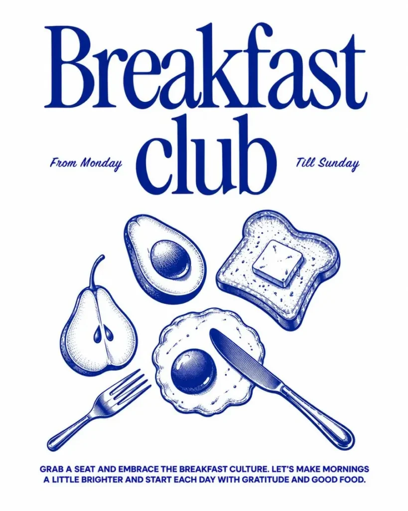
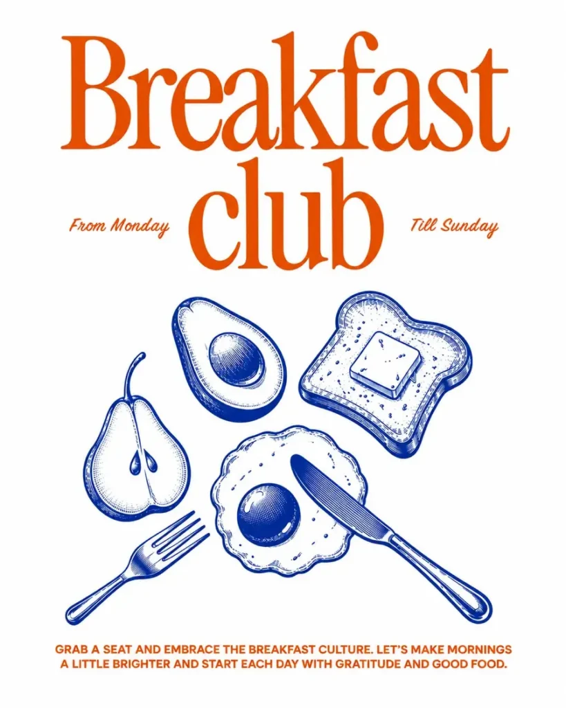
When every element has a similar size, colour or weight, a design feels flat and the viewer does not know where to look. Contrast fixes that. It separates elements and guides the eye. In the Breakfast Club poster, the all-blue version feels flat. Switching the headline and small details to a warm red-orange separates them from the blue illustration, so the eye knows exactly where to start.
How contrast improves a design
- Size contrast: oversized headlines against small supporting text.
- Colour contrast: make the most important element stand out.
- Typography contrast: pair a bold typeface with a lighter one.
- Shape contrast: mix geometric and organic forms.
- Light and dark: use brightness to highlight what matters.
Contrast is not only about bright or opposite colours. It also comes from differences in scale, weight, spacing, texture and position. Used with intention, it creates a focal point and gives the whole layout direction.
Final thoughts: good design starts with a different perspective
Graphic design is a constant cycle of observing, experimenting and refining. The best designs are not the ones with the most elements or the most complicated effects. They are the ones where every visual decision has a purpose.
A new composition, an unexpected type pairing or a different colour direction can completely change how an idea is seen.
Design is not just what you put on the canvas. It is how you help people see it differently.
Want your brand to get the same before and after treatment? Tell us about your project.